Copper is a radiant orange metallic shade that adds a modern twist to any space in your home. This color is also used as a neutral color, pairing with many different hues from light neutrals to deep dramatic shades for a striking look. With so many color choices, choosing colors to pair with copper may seem daunting. We have done some research to bring you an inclusive selection of colors that go with copper for your walls, trim, and accents that you are sure to love.
Copper is modern and sophisticated and can add a warm metallic glow to your home that is unmatched. This color has recently gained popularity in home decor. There are endless color combinations that combine beautifully with copper. These colors include:
- White
- Cream
- Black
- Gray
- Purple
- Green
- Blue
- Red
- Orange
- Brown
Choosing the perfect color to pair with copper in your home is only one of many questions that are sure to arise during your home decor project. You may ask yourself what colors make copper or what the complementary color of copper is. You may wonder if copper and bronze are the same or what metal finish is in style for the year 2022. We will answer all of these questions and discuss other closely related topics; just keep reading!
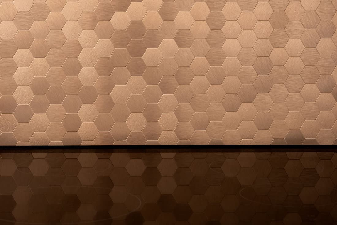
![close-on-elegant-golden-hexagonal-wall, What Color Goes With Copper For Walls, Trim, & Accents? [X Color Ideas You Will Love!]](https://homedecorbliss.com/wp-content/uploads/2022/10/What-Color-Goes-With-Copper-For-Walls-Trim-Accents-X-Color-Ideas-You-Will-Love.jpg)
Neutrals
Neutral colors, both light and dark, are known for their adaptable presence and unassuming charm. Almost any accent color can be added to a neutral color scheme to brighten your room and add some personality.
Pairing your neutral space with bright bursts of copper can add character to your space as well as a vivid metallic color. Add copper to your light or dark neutral space for a modern twist.
1. White
We may include affiliate links and curated AI content to highlight top design styles.
Shades of white are crisp and clean and bring a bright expansive look to any space. White and copper are a stunning contrasted pairing that can bring the simplistic beauty of minimalist decor to your home.
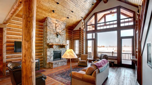
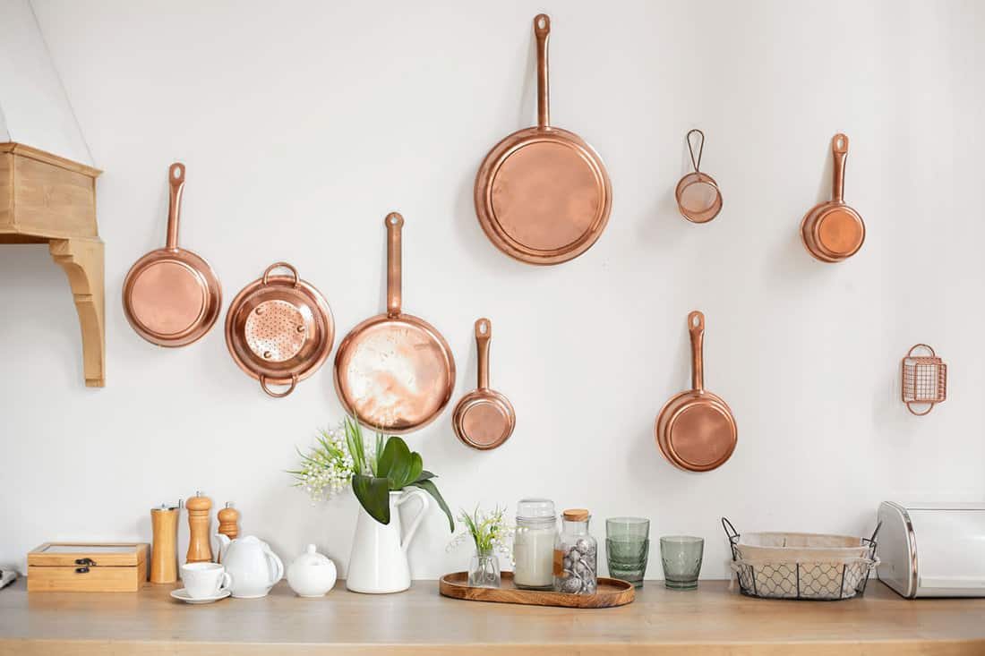
White walls have become hugely popular because of their light neutral brilliance. Copper accents such as lighting fixtures, hardware, or cookware pair perfectly with white walls for a soft rustic feel to your room.

Click here to find this cookware on Amazon.
2. Cream
While shades of pure white are clean and expansive, they can also seem sharp and cold. Warm up this look by using a creamy color instead of stark white.
Cream-shaded cabinets or walls add a certain softness and welcoming ambiance that basic shades of white can lack. Pairing this muted warm neutral shade with copper accent pieces adds a toasted earthy feel to your space.
3. Black
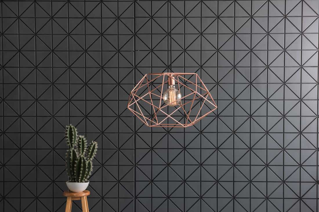
The ultimate in dark neutral colors, black walls can add a bold look to any space. Pair sleek shades of black with copper light fixtures or other accent pieces for a dramatic modern appearance in your home.
Deep shades, like black, can easily overwhelm your space if not balanced with other colors carefully. Orangy tones add a pop of energetic color that helps to tone down your black-colored room.
4. Gray
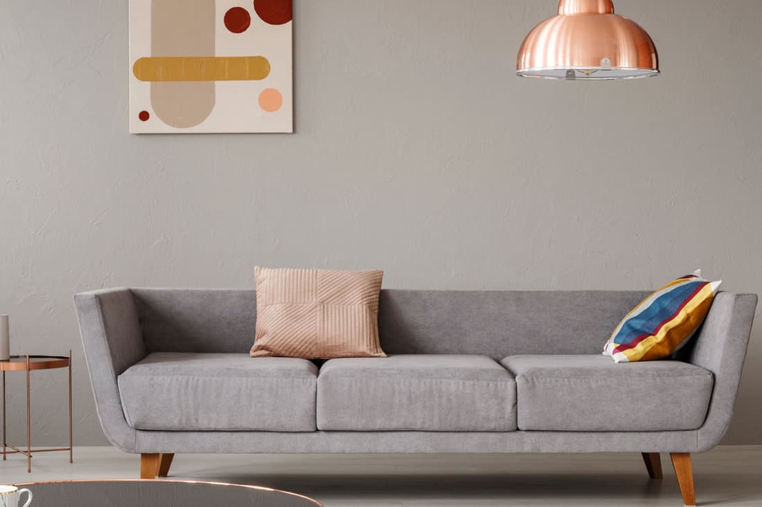
Gray is a perfect mixture of black and white shades that brings a subdued modern edge to your room. Gray is a muted version of black, so it boasts some of the same sleek urban characteristics of black without the overbearing tone.
A gray and copper color scheme is tranquil and cool with just the right spark of color. Accent this color palette with warmer brighter colors, like natural wood furniture or wall art, to bring out the warmth in this color scheme.
Jewel Tones
Jewel tones are rich and extravagant, creating a bold exotic palette. The luxurious warmth of copper combines perfectly with luxurious jewel tones for a rich elegant ambiance.
These shades represent different shades of jewels, such as emerald, amethyst, and sapphire. The deeply saturated and dramatic tones can be the perfect pairing for copper home decor.
5. Purple
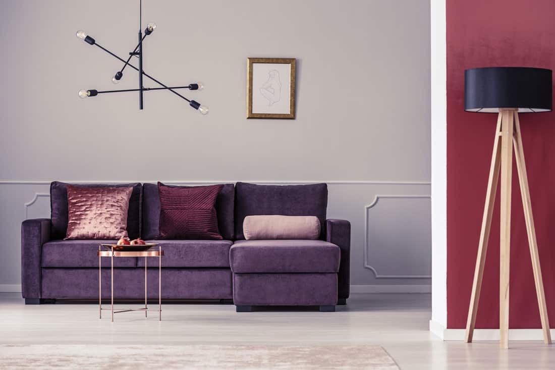
Purple is a gorgeous mixture of red and blue, the perfect balance of warm and cool. This jewel tone is dramatic and moody, just as the amethyst that it represents, and it pairs beautifully with warm metallic copper.
Purple brings out the soft pink undertones in copper metal decor. Muted grays with purple undertones cover the walls of this room for a soft backdrop for a striking purple couch paired with a copper table.
6. Green
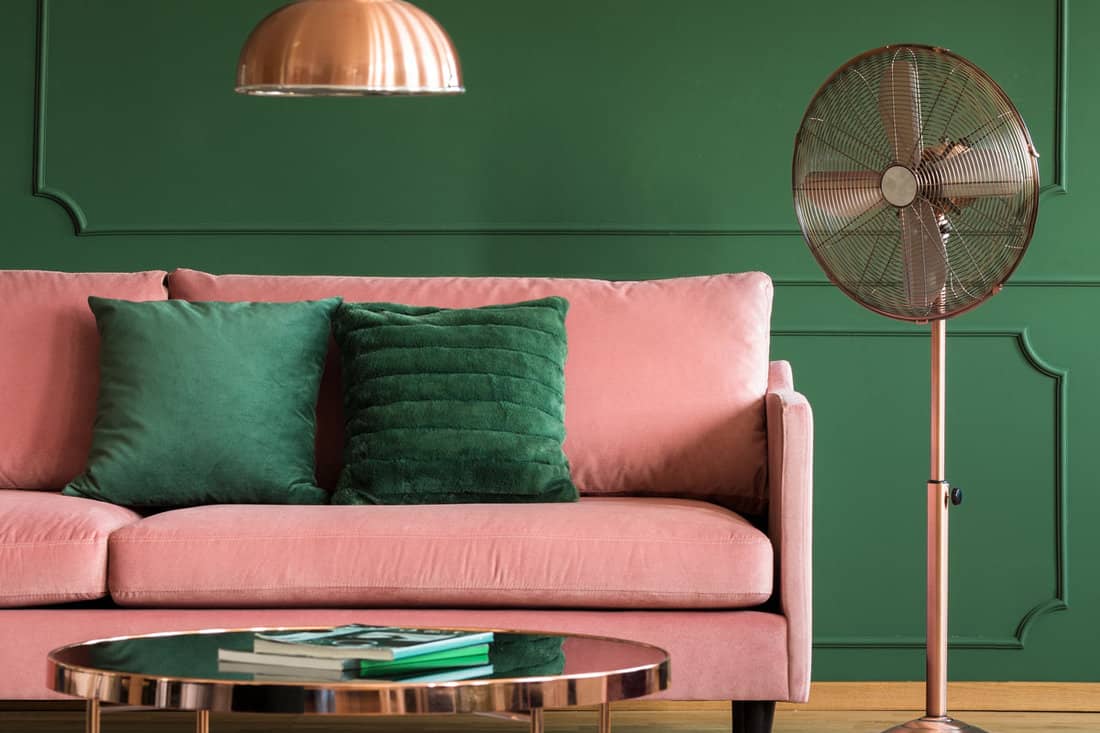
Green is an elegant jewel tone that brings a tranquil sense of nature into your space. The perfect mixture of blue and yellow, green is cool, calm, and as sophisticated as emerald.
Shades of green bring out the orange undertones of copper. Complete this color scheme with a soft coral shade that creates a cohesive look when paired with copper.

Click here to find this copper lighting fixture on Amazon.
7. Blue
Calming tones of blue bring out the bright orange undertones in copper decor. Conversely, vivid shades of copper accentuate the rich deeply saturated cool shade of blue.
Add soft shades of white or gray to this color palette for a detailed and dimensional look. Use several shades of blue, ranging from light blues to deep navy blues, on walls and furniture to create a layered effect.
Warm Tones
Use caution when pairing copper with warm tones. Bright warm colors, especially on walls, can easily overwhelm warm metallic copper shades, but this doesn't have to be the case.
These rich shades can combine for an elegant welcoming appearance. Accent a warm color palette with pops of other more neutral colors to ground this look and add a sense of dimension.
8. Red
Fiery shades of red can make the perfect striking color companion to copper. The soft warmth of copper accents tones down the look of vivid shades of red.
Add a polished look to this color scheme by using black decor. Soft white linens balance this strong color palette and add some softness.
9. Orange
To bring out the bright citrusy undertones in copper, pair this warm metallic shade with bright tones of orange. Orange is a juicy mixture of red and yellow that creates a cohesive look in any space when combined with copper.
This color combination is spicy and stunning, which is sure to turn heads in any area of your home. Elaborately designed copper pillar trim makes for a majestic ambiance that is captivating and vibrantly stunning against this orange wall.
10. Brown
Combine copper and brown for an earthy warm look that is bright and inviting. This color palette creates a toasted ombre appearance that is elegant and rich.
Add some light-colored furniture to this color scheme to keep these colors from being overbearing in your space. Warm shades of natural wood complete this brown-toned palette.
What Colors Make Copper?
Combine red with brown to make a copper color base. Blue and yellow make shades of green, so red, blue, and yellow can all be combined for this same effect.
Use deeper brown shades or more blue (if using the primary color mixing method) to make your copper a deeper shade. A metallic mineral powder can be added to this color mixture for the signature shiny metallic look.
What Is The Complementary Color Of Copper?
Copper is a mixture of red and brown which makes blue and green complementary colors. Teal or shades of blue-green are complementary colors to copper.
Because of the complementary nature of these colors, teal and copper make a stunning color combo. Use this color scheme for a dramatic contrasting effect.
Are Copper And Bronze The Same Thing?
Bronze metal actually contains copper, so they share many common characteristics. While at first glance copper and bronze may seem like similar hues, they are actually different colors and metals.
Copper, bronze, and brass are all known as red metals because of their characteristic warm metallic shade. Copper is the reddest metal of the three, with a distinct orange undertone that brings a vivid glow into your space.
What Metal Finish Is In Style For 2022?
While hardware can seem like an afterthought, different metal shades can add a ton of character and personalized style to your room. Black has been the hottest color in hardware for 2022.
Black is a sleek modern color that adds an unmatched sense of intrigue to your space. Other popular colors in hardware for this year are gold, brushed and polished brass, gold, and copper.
Final Thoughts
Copper has become quite popular due to its stunning warm metallic glow. While copper may seem like a trendy color, this shade looks like it is here to stay.
Make a statement in your home by using copper along with one of the colors that we have discussed. We hope that the above listing of colors to pair with copper has helped inspire your home decor project.
Before you go, here are some other articles that may be of help to you:
14 Classy Copper Bedroom Accessories You Need to See