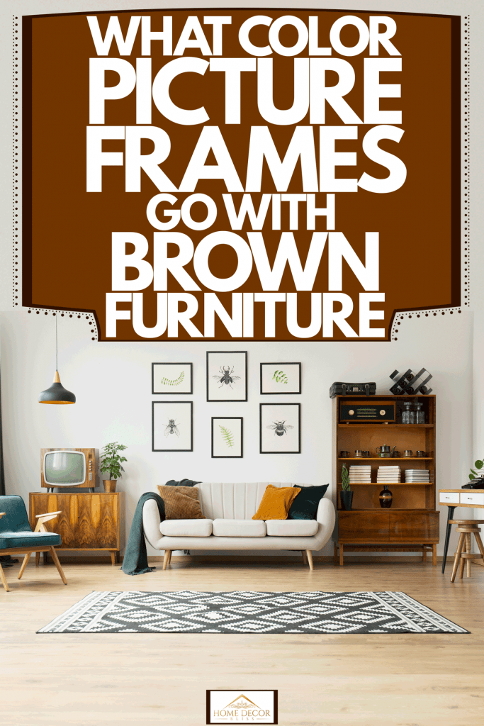
When you get down to the nitty-gritty of designing your room, you may start thinking, what color picture frames will go great with my brown furniture? We understand how important these types of decisions are, so we've done the research and put together a great list of complementary colors. Let's take a look at what we found.
Here are some great color picture frames to match with brown furniture:
- Gold
- Red
- White
- Distressed Wood
- Green
- Blue
- Natural
Let's look at each color frame and talk about why they work so well with brown furniture. We'll also talk about if your picture frames should match your furniture, if you should center them over your furniture, and how you might style a picture shelf. So please, keep reading for all of the design details.
Picture Frame Colors That Work With Brown Furniture
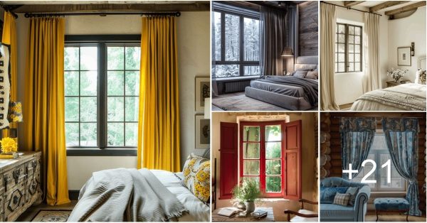
As we compiled this list, we took into consideration that brown furniture can come in different tones. There are the lighter browns of Scandinavian styled and some mid-century-modern-style pieces. There are the greyish and varied browns of distressed wood furniture. And then, there are the rich chocolate or russet browns of antiques or pieces made out of traditional hardwoods like oak, mahogany, and cherry. We'll talk about which type of brown furniture these colors will go best with.
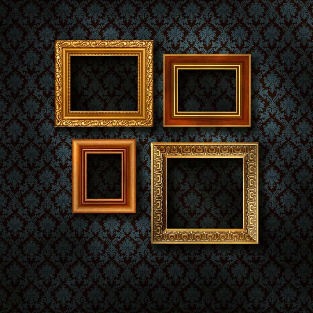
Gold Frames
We may include affiliate links and curated AI content to highlight top design styles.
Gold is a natural pairing with brown furniture. And it actually works well with all shades of brown. This is because brown and gold both rely heavily on yellow tones for their final color. The yellow in both of them means they will work well together. If you have beautiful antique furniture, then you might consider some ornate gilded gold frames. If your furniture is more streamlined and modern, look for gold frames that are less ornate in style.

Clean-lined pieces like this will work well with cleaner-lined furniture pieces. Click here for this set of two frames on Amazon.
Red Frames
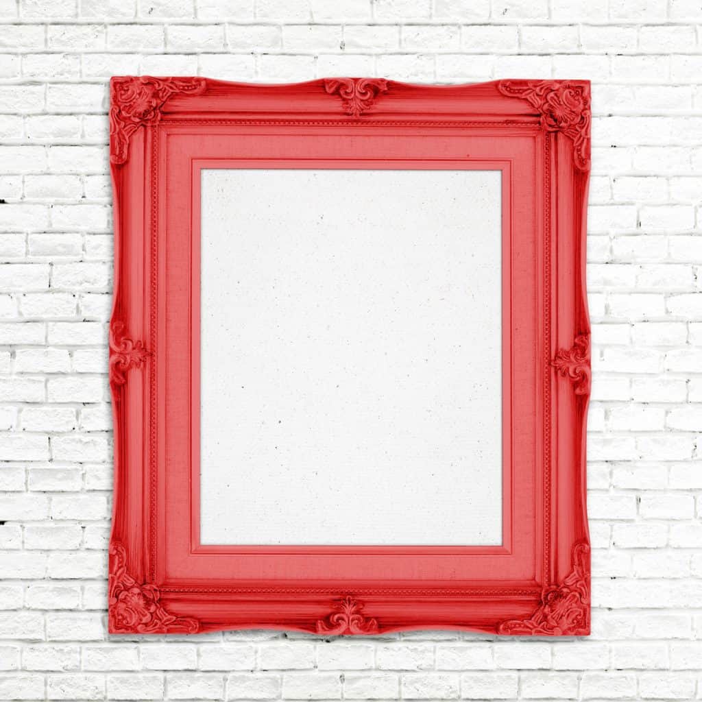
If you like to have a bit of fun with your design, red is a great color picture frame to go with brown. Like gold, it has those same warm tones that you find in browns. It's a great accent color to pair with all types of brown furniture, which means it works for other elements besides your picture frames as well.
White Frames
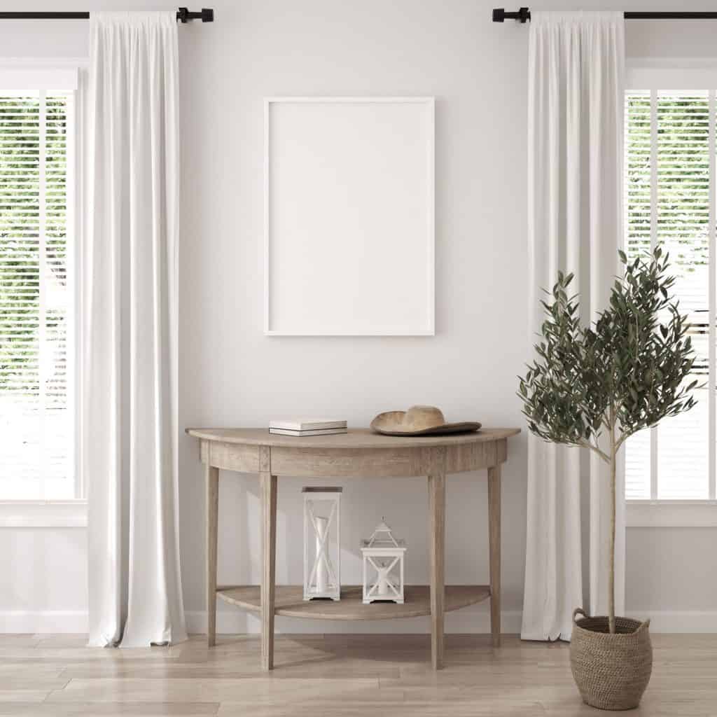
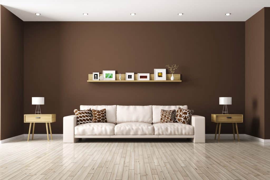
White is a color that will go with pretty much everything, so why not with your wood furniture? We particularly like white frames in rooms that utilize paler shades of wood like beech or ash. This white frame looks lovely about just such a wooden side table and is framed with beautiful white drapes. The pale wood floors finish off this look.

Here's a lovely set of white frames for a gallery wall of family photos or pencil sketches of your pets. Click here for this on Amazon.
Distressed Wood Frames
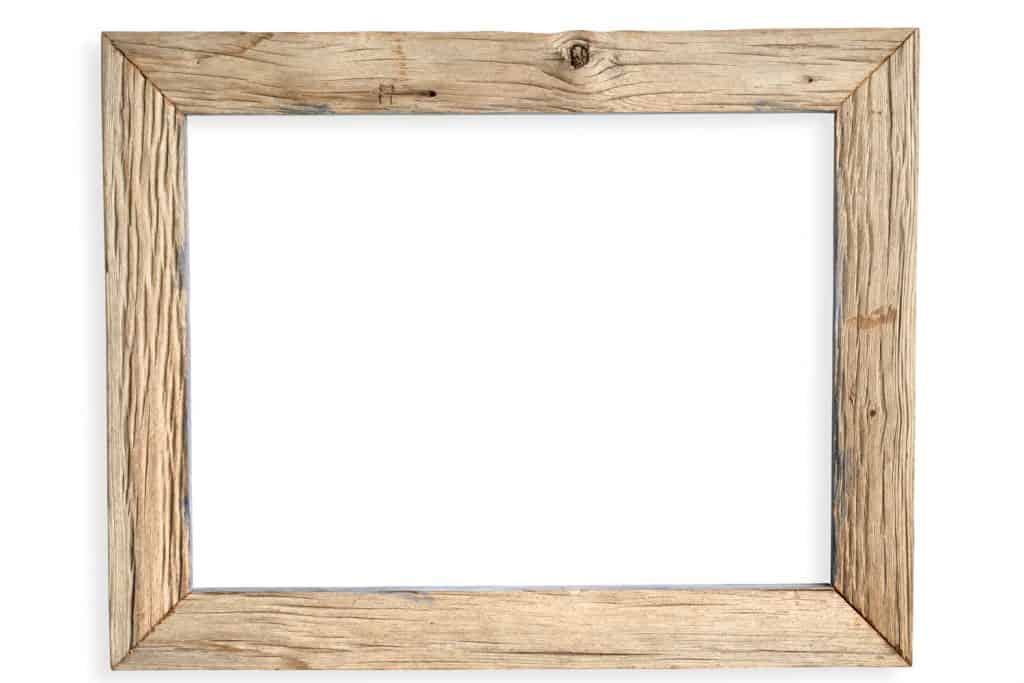
If you have a farmhouse-style home with lots of beautiful weathered antique pieces, then why not go for the same look with your picture frames? There are so many great variations on these gorgeous frames. You can find them in natural wood colors or painted with whites or turquoises then sanded down, so the wood shows through in places. You could even go out and do a thrift store run and create a beautiful collection of rustic and distressed frames for your wall.
Green Frames
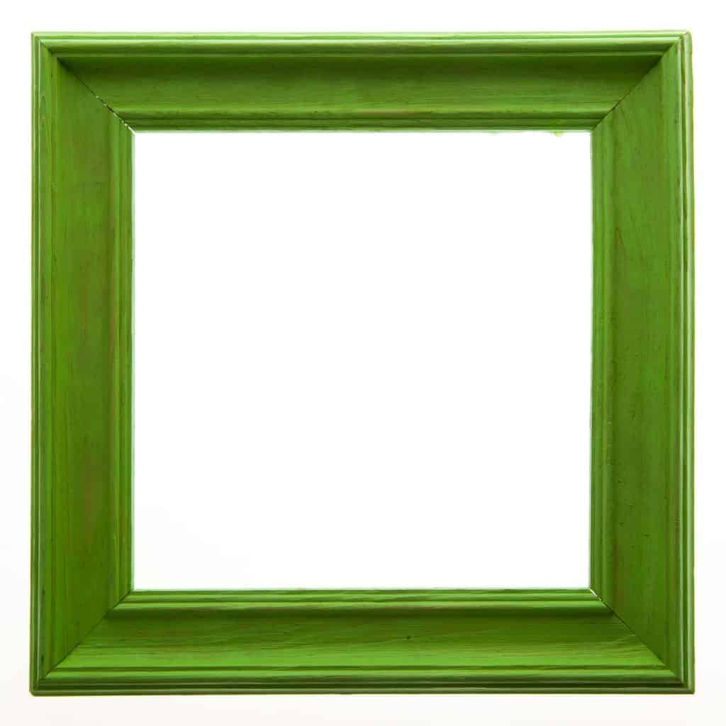
Green and brown are natural fits. Think of the trees in the closest woods are the soil and the grass. These two colors are nature epitomized and do fabulous together. We particularly like pairing a rich emerald green frame with a stunning walnut sideboard. Or maybe a soft mossy green frame with a teak bench. There are so many colors and shades, several combinations to play around with.

Here is a wonderful set of two 12- by 16-inch wooden picture frames in rich deep green. Click here for this on Amazon.
Blue Frames
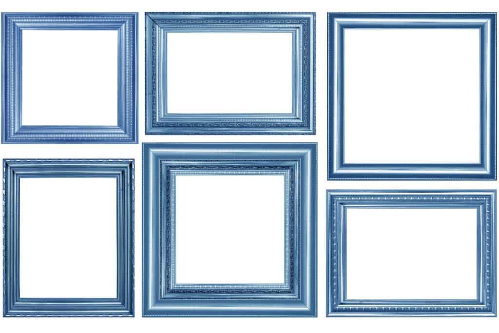
If you've visited many of our posts, then you know that we really love blue. It's a color that goes so well with so many other things. And there is so much variety to choose from. Navy will be gorgeous with your more traditional pieces, while you might choose a robin's egg blue to go with your Scandinavian style pieces. Or, you could find a bunch of vintage frames and spray paint them all the same shade of blue, exactly to your specification. You might even mimic a shade that's in your rug or curtains.
Natural Frames & Matching Woods
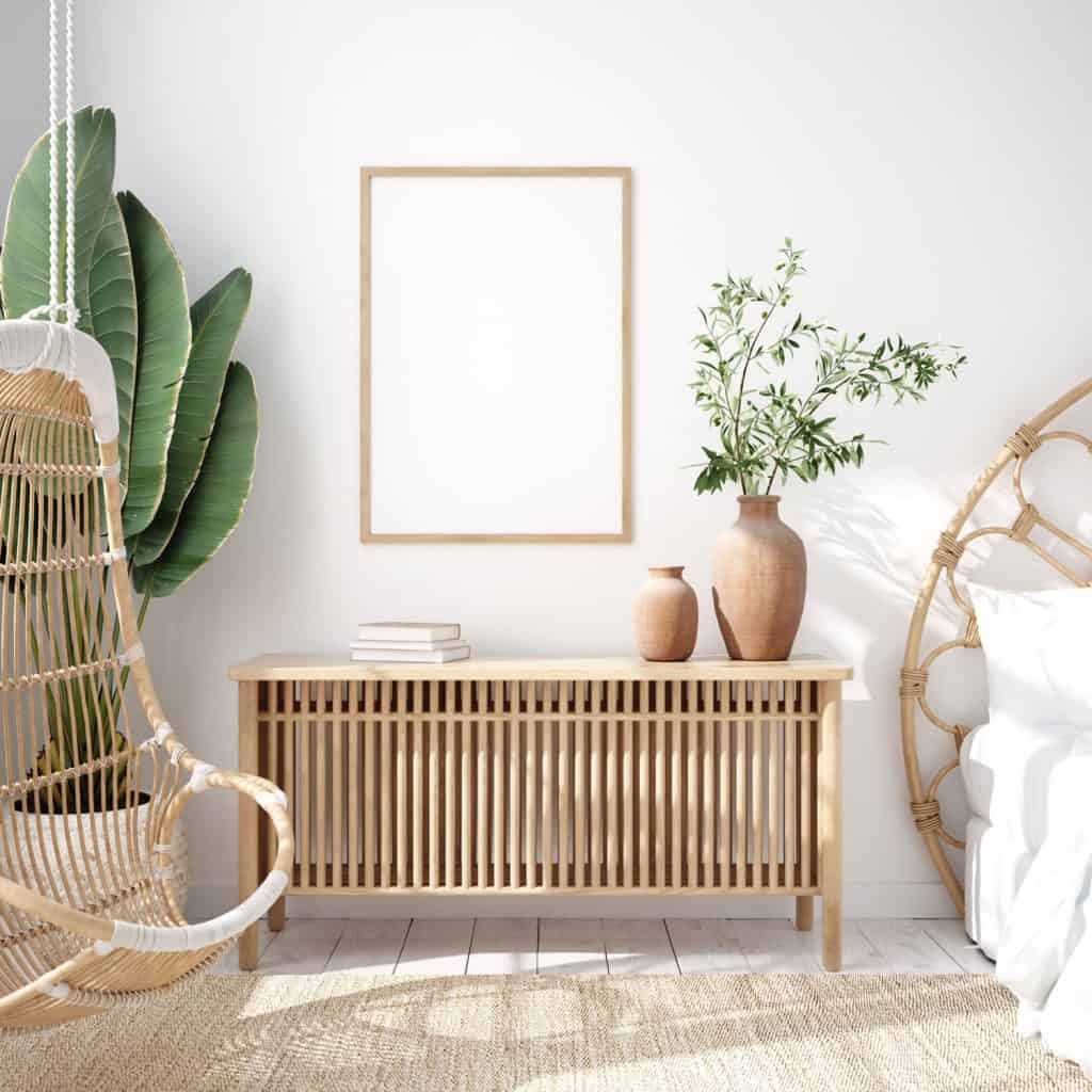
If your wood furniture is light in color, and you love a spa feel in your rooms, consider matching your picture frame color to the color of your furniture pieces. The look you get will be very cohesive, and it will seem that everything was made perfectly for each other. You can also match wood types. If you have mahogany furniture, then buy mahogany picture frames. Same for oak and other woods. There's nothing wrong with taking a matching approach if that's what is visually appealing to you.

You can find picture frames to match most types and shades of wood furniture. This mahogany frame is available on Amazon.
Should Picture Frames Match Furniture?
Picture frames definitely do not have to match your furniture. Of course, it's always good to have colors that relate to one another. For instance, if your frames don't match your furniture, maybe they pull from another color in your upholstery or a rug. You could also choose to use a colored frame to create a really fun wall of art and photos.
We really love this example of a gallery hanging wall. The frames are painted in different colors and represent a mix of shapes. Some actually contain artwork, and some are empty. It's a really beautiful and unique way to style an entry hall table.
We have a post on hall tables here: "How to Decorate an Entryway Table [8 Actionable Suggestions]."
Should A Picture Be Centered Over Furniture?
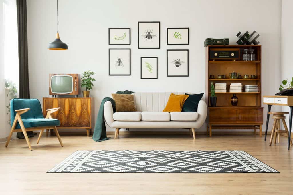
Generally, if you're going to hang a picture or mirror over a piece of furniture, it should be pleasing to the eye. This doesn't mean it has to be directly centered, particularly if you're hanging a grouping, but if it's not, you might find it bothers you. In general, if you have a solo piece of artwork, you're going to want it to be big enough that it doesn't look like a postage stamp above the piece. Or use two or three smaller pieces together.
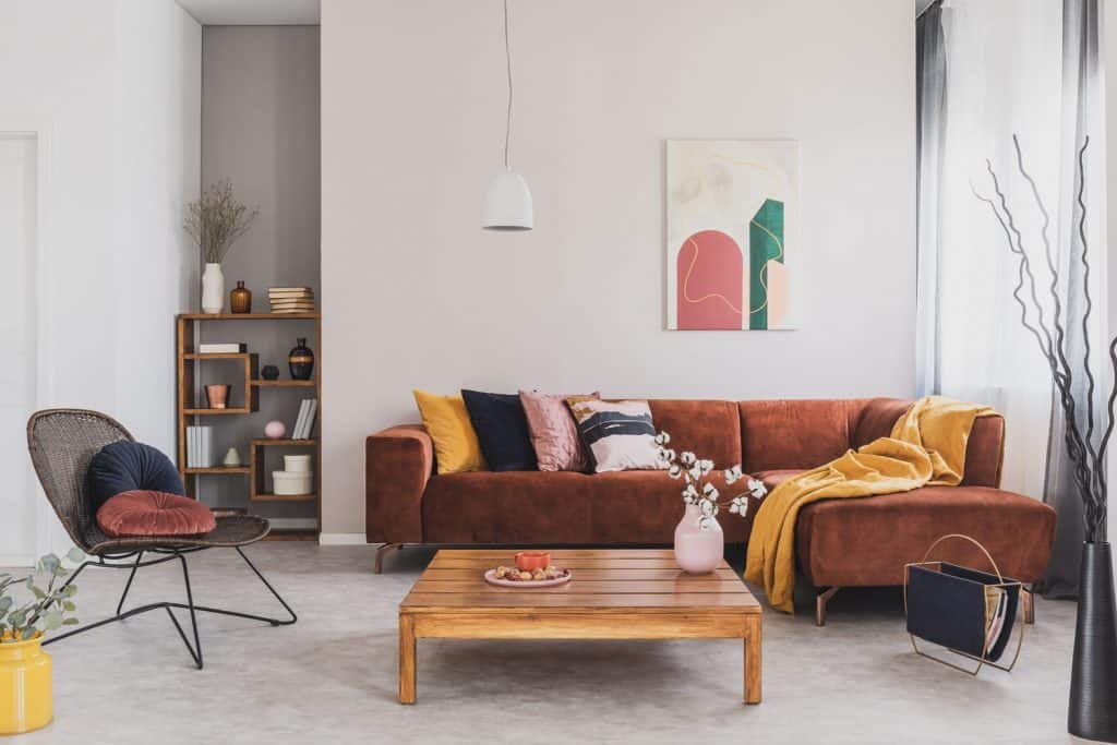
In this living room, the painting is not centered above the sectional, but that is because of the pendant light. They are considered together for hanging, and as a result, the two look balanced with the sectional.
How Do You Style A Picture Shelf?
A picture shelf is a really unique way to display artwork and photographs. In essence, it's a shelf that has a small ledge that allows you to lean small framed pieces and other items, like plants and vases, against the wall. This is in lieu of hanging them with picture hooks.
This beautiful picture shelf has several color photographs framed identically in white, with white matt boards. Interspersed are some small ceramic vases. The look is really chic and uncluttered.
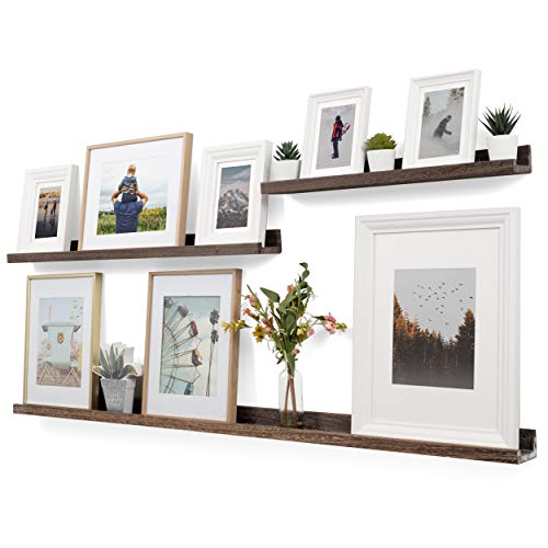
Picture shelves are a great way to reduce the number of holes you have to put on your wall in order to display the objects you want to see. Click here for this group of three shelves on Amazon.
Have Fun With Your Wall Decor
One of the best things about home design is the ability to have some fun. Picture frames are a great way to express yourself personally—both by the frames you choose and what you put inside of them.
We hope you enjoyed this post here at HomeDecorBliss.com. Please do check out a few of our other posts below: