
The color that you choose when designing your space at home is incredibly important. There are so many theories on specific colors eliciting specific feelings and emotions in people. For example, using turquoise when designing your home space can elicit calm, creative, and joyful feelings in you and your guests.
Turquoise pairs well with many colors. It is bright enough that it can be used as a pop of color amongst darker or more neutral shades. Or, turquoise can be used as the main color in a space. Some colors that turquoise pairs well with include yellow, pink, copper, gold, blue, grey, and more.
There are many benefits to choosing to decorate your home with accents of turquoise. These benefits include bringing peace and tranquility into the space as well as showing confidence and sophistication. The color turquoise is also known to relieve feelings of loneliness.
Continue to read this article to find inspiring images that were chosen specifically in hopes that they will help you decide that turquoise should most certainly be a part of your home decor color palette.
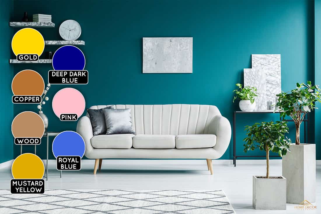
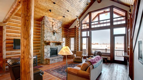
1. Deep Dark Blue
As you can see in the photo, this living room accentuates the art of layering colors and styles. The dulled turquoise walls truly allow the dark blue couch and gold features to shine in this living room. The room is sophisticated with the deep blue and touches of gold that pair well with the marble table in the center.
We may include affiliate links and curated AI content to highlight top design styles.
This living room would look wonderful if you just counted the furniture and decorations, but by adding in the turquoise wall and touches of turquoise in the pillows, you can see just how much style is added.
There are relaxing tones throughout this room that will bring about a calming feeling while showing just how confident and sophisticated you are.
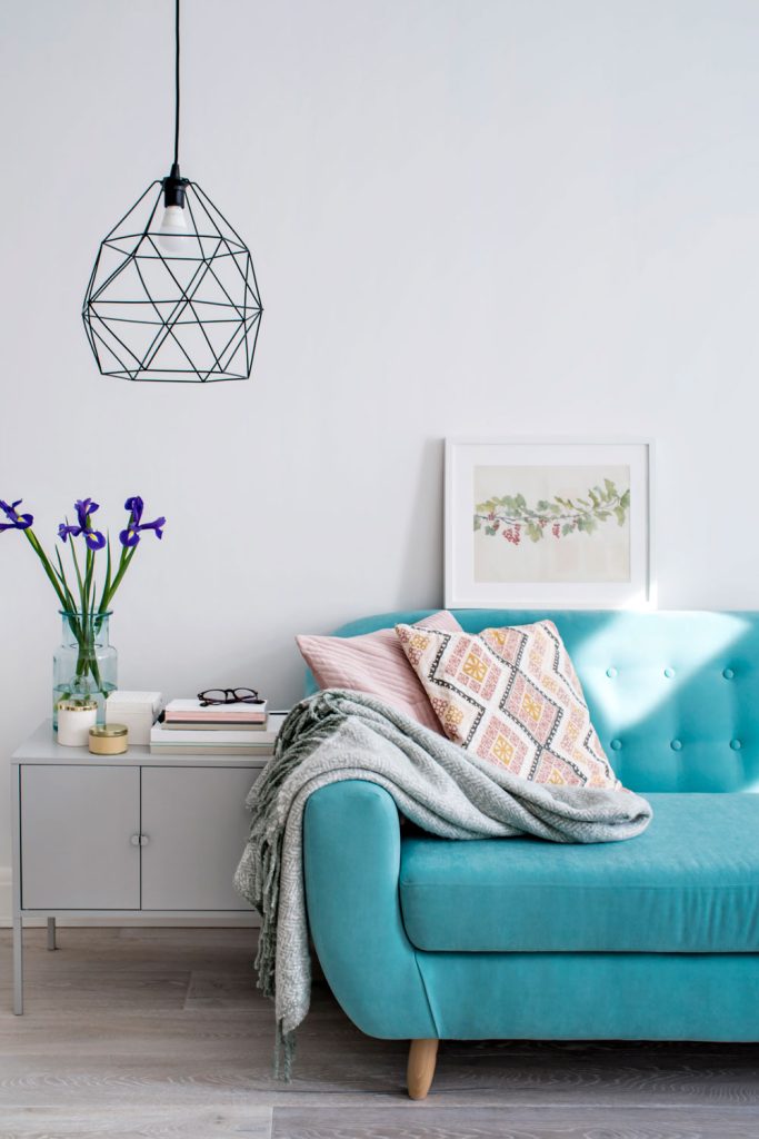
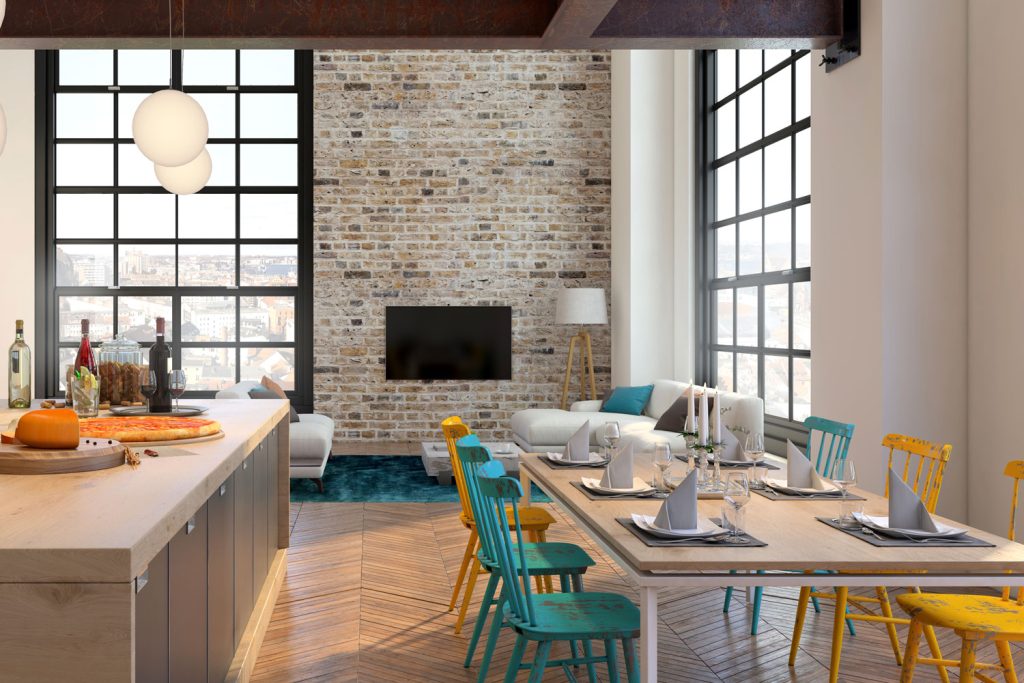
2. Pink
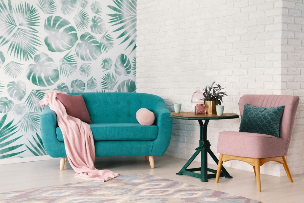
In this photo, you can truly see how well turquoise pairs with this baby pink tone. This color scheme is definitely best when chosen to fit into a bright-colored room as you can see with the white brick wall in the background. This room is peaceful and calm all while staying colorful and joyful in the design space.
If choosing a turquoise and pink color palette, be sure to choose lighter shades of both colors to avoid overwhelming the senses and creating a harsh color environment.
This deep turquoise plush blanket could be a great addition to your living space!

Click to see this product on Amazon.
3. Color Medley
In this space, the designer made a direct choice with the white wall and the turquoise couch. Then, the designer seemed unsure of what other colors they should decorate with.
As you can see in the picture, there is a pop of purple in the flowers, which does seem to pair very well as long as the pop of color stays fairly small.
Plus, there are three other small pops of color that stick out. These include a yellow candle, pink accents on the pillows, and the green in the photo on the wall. Yellow pairs so well with turquoise, which will be mentioned later in the article.
Pink also pairs well, which was mentioned previously. Green has yet to be mentioned, however, it seems to pair well in small doses such as in this example.
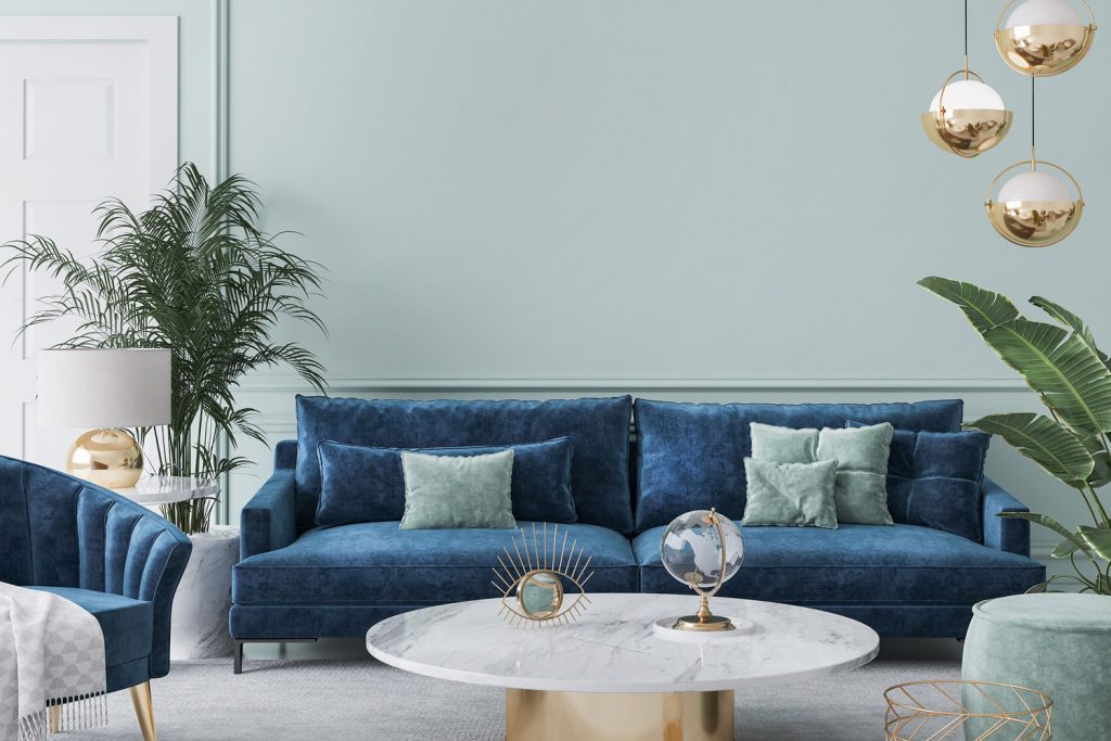
4. Royal Blue
This photo shows how well turquoise and royal blue pair together. They match and complement each other while still adding layers to the room with the two different shades of blue. The best thing to do if choosing to do a turquoise wall with dark furniture is to add some white to brighten up the room.
In this case, white is included through the picture frame that is hanging on the wall. Another thing to notice in this image is the bright-colored decorative pillow. This pillow adds some more contrast to the room since the main two colors are very similar.
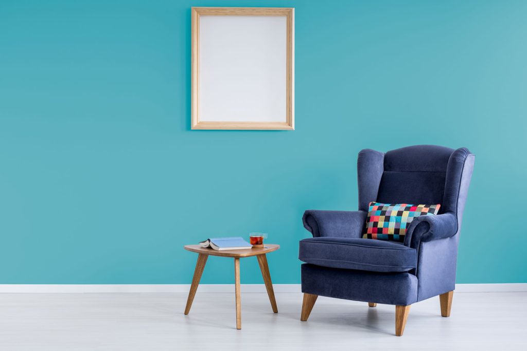
Read more: Beautiful Blue Couch Living Room Ideas
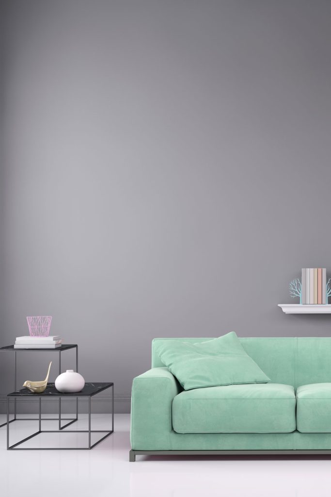
5. Neutrals
Choosing a neutral tone for the walls in your design space gives you so much freedom with color schemes. In this image, you can see that the designer chose a bright turquoise for the couch that contrasts well with the grey wall paint.
If choosing to use mainly turquoise touches for furniture, you can keep everything else neutral to make turquoise the center of attention. In this image, the turquoise demands attention because of the wall being neutral as well as the end tables and the shelf on the wall.
This ottoman is a super easy and stylish way to add a turquoise splash to any room.

Click here to see more on Amazon.
6. Gold
This image looks so simple, yet the style is so elegant. Turquoise and gold exude such sophistication, elegance, and boldness. There is no denying how well the two colors complement each other and bring out the best in the other. The room is so light and airy, very natural, refreshing, and balanced.
With such bright colors, it was smart of the designer to add a touch of purple with the flowers. Although, the room could probably benefit from a bit more of that accent color.
7. Copper
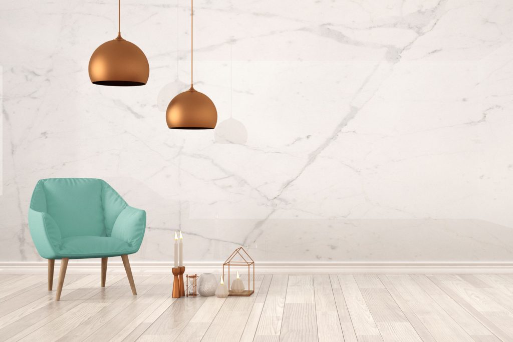
If you like the idea of gold tones but want a more rustic feel, copper may be the best option for you. Copper tones match well with turquoise furniture as you can see in the photo. Copper is a bold choice, more so than gold, but when done correctly, copper can really tie a room together.
Once again, notice how well these designs work with a light-colored background or wall. This will really bring out the color of the copper and the turquoise.
This turquoise and copper chair could be perfect for your design space. It is modern and stylish—perfect for any office or living room!

Click here to see more on Amazon.
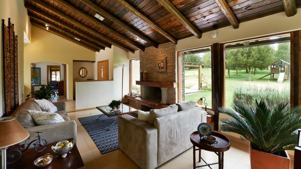
8. Wood
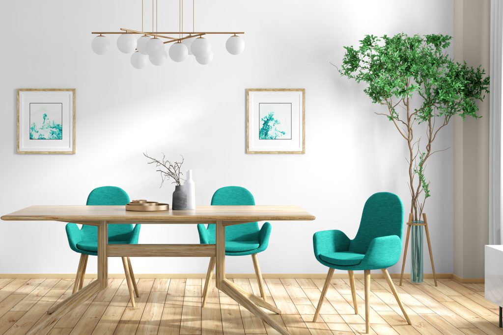
In this image, you can really tell that the designer wanted a very natural theme for the dining room. Turquoise is a very natural color in the essence of the ocean. Therefore, with the wood tones and the plant in the corner, this room seems very in touch with nature.
This room, with the natural light, brings a feeling of serenity and peace to whoever enters it. The light-colored wood was a good choice, as it brightens the room even more than the white wall does on its own.
The other style choice to touch on is the different shapes and edges used in this design. The table does not have just four straight legs; instead, they are bent and angled differently to bring an abstract design in. Also, the light above the table uses sphere bulbs to add a smooth style to the room.
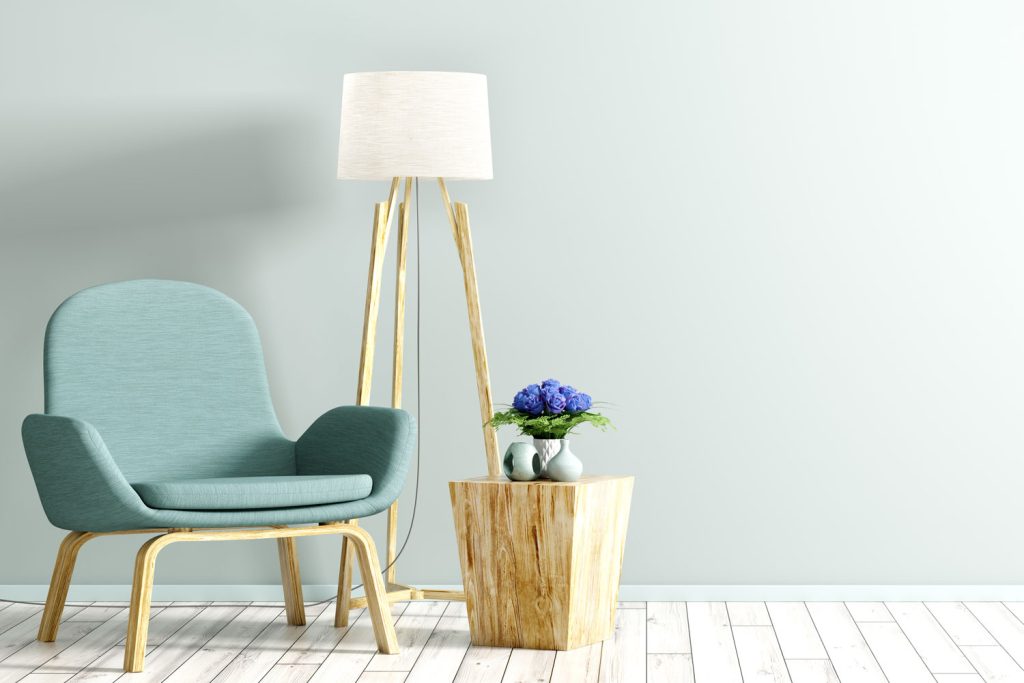
9. Mustard Yellow
This living space has duller and more neutral colors so that the turquoise and mustard yellow dining chairs can demand attention. The chairs are so simple, but by adding color to them, they are completely revamped and are a tad more modern than they would be without the color pop.
It is important to note that turquoise is not the main color in this space, yet your eyes focus on it before focusing on the rest of the room. This is a great idea for someone who is looking for a small pop of color without drowning the space in bright, bold colors.
Check out these vases that would make for a great centerpiece on a dining room table.

Click here to see more on Amazon.
10. Light Yellow
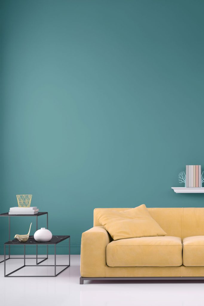
This room is just begging for attention, yet it deserves every ounce of attention it gets. It is so simple yet complicated and creative.
This picture may seem similar, as it is the same layout as one of the previous examples. However, the other picture had a grey wall and turquoise couch. This color combination is much bolder than the previous one.
The light yellow and turquoise mix is very natural with both bringing energy to the room. If you aim for more energy and boldness, brighten up the yellow tone. The opposite works too; if you are aiming for a cooler and calmer room, lower the shade of yellow or turquoise.
Read more: What Goes With A Yellow Couch?
11. Red
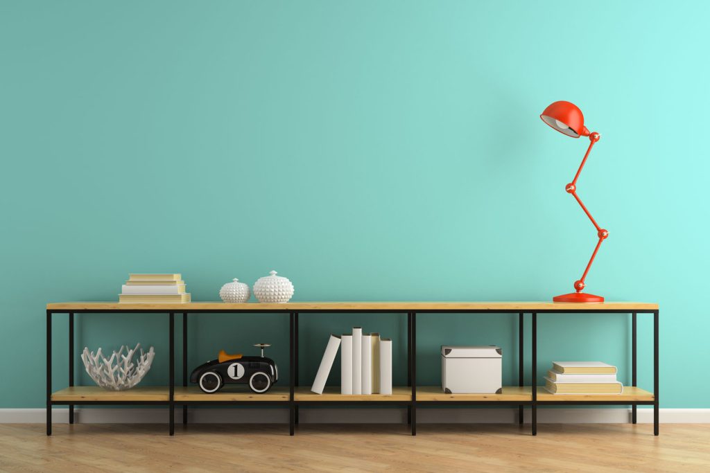
This color combination, while seemingly unlikely to work, somehow does work. The red is a bold choice but choosing a small but important piece in the design space, such as this lamp, can absolutely make a huge impact on the space.
If choosing to do a color palette this bold, it is necessary to stick to neutral colors for all other furniture pieces as shown in this picture.
In Closing
Turquoise is a bold but sophisticated choice for your home. It exudes energy and creativity, showing off exactly how intuitive and balanced you are.
Before deciding on paint or furniture in this color, be sure you know what other colors and styles you are looking to add to it. Turquoise can add a unique sense to your house but only when done correctly.
This is a great piece, well done. Turquoise is so much more than just “Southwest” decor and it’s wonderful to see that turquoise has escaped to the larger world. The ideas and suggestions here are thoughtful, and thought provoking. We’re redoing a kitchen in a house built in the 1930’s. We started with retro turquoise appliances- and I’m really excited now to see that space come together. Thanks for all the ideas!